TFI Workspace
Designed a unified workstation that improved the efficiency of managing a tear film analysis system.
Collaboration
1 Product Manager
1 Developer
1 COO
Tools Used


Introduction
The TFI product is a clinical tear film analysis platform used by ophthalmologists and technicians to review examinations, manage patient data, and generate clinical reports. The existing applications were already in use, but workflows, inconsistent interfaces, and limited support for clinical environments created opportunities to improve the overall experience.
Due to confidentiality, some product details and patient information have been omitted or anonymized. This case study focuses on the UX process, key design decisions, and selected parts of the final experience.
Understanding the Challenge
The existing applications were functional but outdated and fragmented across separate interfaces. The redesign have to focused on modernizing and unifying the overall experience.
Context
The Goal
Designing a unified workstation application for multi device workflows by redesigning the existing apps and introducing new tools to better support user needs. Creating a consistent design system to improve usability and efficiency across the platform.
Target Users
Ophthalmologists managing patients analysis data and clinical reports
Technicians responsible for supporting and maintaining the workstation platform.
The Problem
The existing tools lacked visual clarity, usability, and consistency, while workflows were scattered across multiple applications. The platform also needed a dark mode-friendly interface optimized for low-light examination environments where eye analysis is performed.

Deliver
Review existing applications and identify workflow and usability issues.
Redesign existing applications and design new ones.
Create a scalable dual-mode design system.
Create a a dual-mode design system.

User Personas

Dr. Jennifer Wang

Ophthalmologists
Dark environment
Goals
Review and compare patient tear film analysis quickly.
Access clinical reports and measurements in one
unified workplace.
Reduce visual strain during long examination sessions.
Frustrations
Switching between multiple disconnected
applications.
Poor readability and cluttered data visualizations.
Bright interfaces causing discomfort in dark
environments.
Needs
A clear and low-strain dark mode interface.
Fast access to patient analysis history and reports.
Consistent workflows across all workstation tools.
Danel Ross
Technicians
Light environment
Goals
Monitor and manage examination data efficiently.
Support report generation and workflow operations.
Maintain stable and organized platform usage
throughout the day.
Frustrations
Inconsistent UI patterns between tools.
Eye fatigue from high-brightness white interfaces.
Time wasted navigating complex workflows.
Needs
A balanced light mode with reduced glare.
Clear system organization and navigation.
Reliable and consistent interface behavior across
applications.
The Mission
1
Unified clinical Environment
A centralized space that combines tear film analysis, reports, and clinical tools into one consistent platform, reducing fragmented workflows and improving usability.
2
Adaptive reporting & dual-mode system
A redesigned reporting ecosystem with light and dark mode experiences optimized for low-light examinations and all-day workstation usage.
Report Viewer
The Report Viewer is a clinical application designed to organize and manage patient eye examination data and measurements, enabling doctors to efficiently filter, review, and export database records for each patient.
Original Report Viewer

Feature Evolution & Fixes
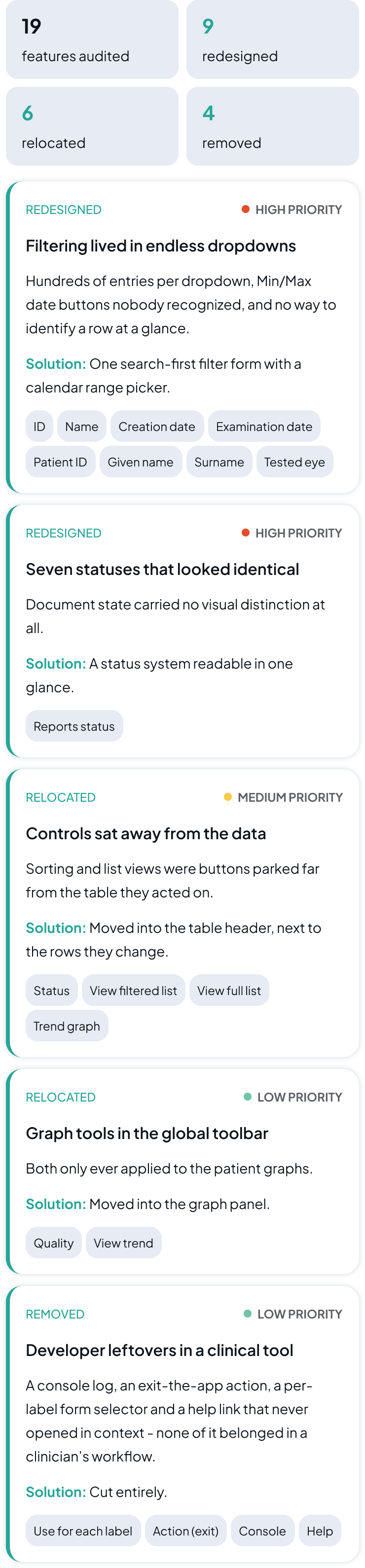
19
features audited
9
redesigned
6
relocated
4
removed
REDESIGNED
HIGH PRIORITY
Filtering lived in endless dropdowns
Hundreds of entries per dropdown, Min/Max date buttons nobody recognized, and no way to identify a row at a glance.
Solution: One search-first filter form with a calendar range picker.

REDESIGNED
HIGH PRIORITY
Seven statuses that looked identical
Document state carried no visual distinction at all.
Solution: A status system readable in one glance.
Reports status
RELOCATED
MEDIUM PRIORITY
Controls sat away from the data
Sorting and list views were buttons parked far from the table they acted on.
Solution: Moved into the table header, next to the rows they change.
Status
View filtered list
View full list
Trend graph
RELOCATED
LOW PRIORITY
Graph tools in the global toolbar
Both only ever applied to the patient graphs.
Solution: Moved into the graph panel.
Quality
View trend
REMOVED
LOW PRIORITY
Developer leftovers in a clinical tool
A console log, an exit-the-app action, a per-label form selector and a help link that never opened in context - none of it belonged in a clinician’s workflow.
Solution: Cut entirely.
Use for each label
Action (exit)
Console
Help
Color Inspiration
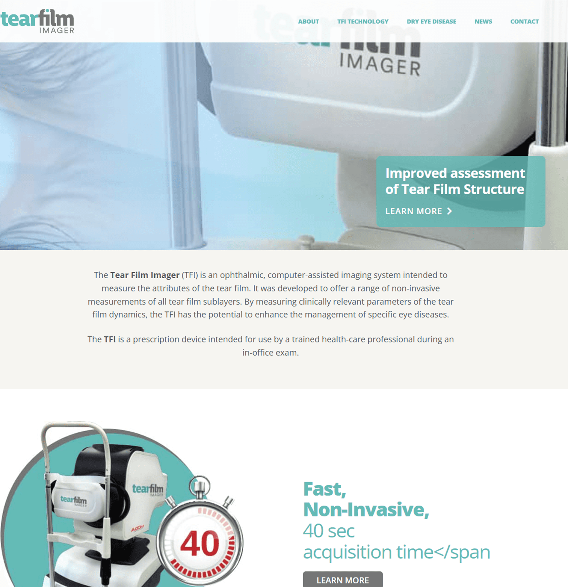
Light Mode

I used the primary color of the Tear Film Imager site brand, incorporating lighter surfaces with dark text to maintain readability while avoiding harsh pure white backgrounds.
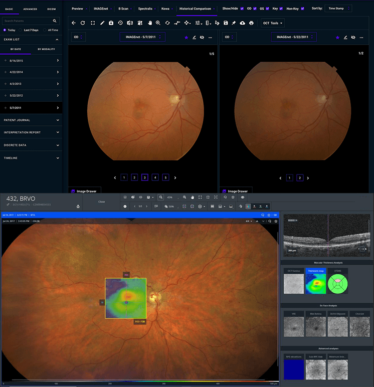
Dark Mode

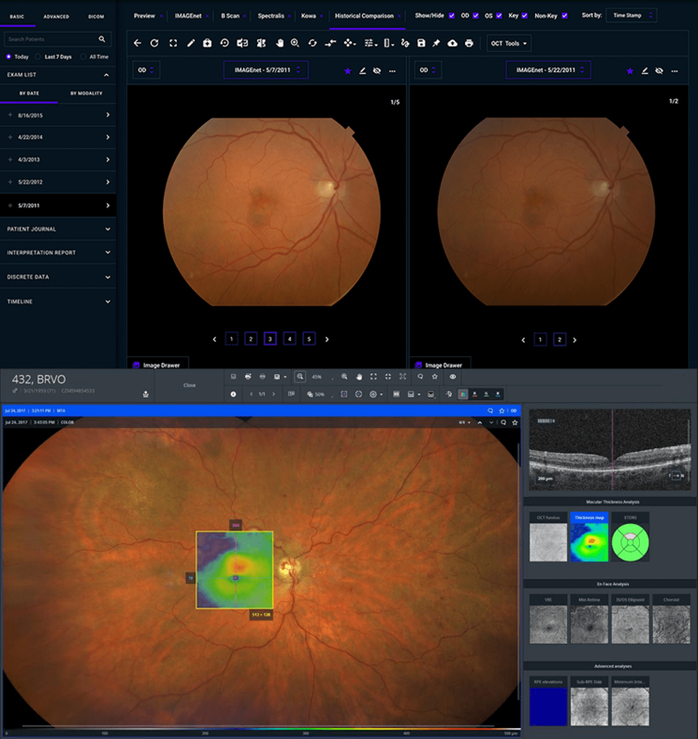
Although AdOM's brand color is red, I chose not to use it as the primary color since red is reserved for semantic states like errors and alerts. Inspired by competitor platforms, I adopted an azure blue paired with dark surfaces and light text to improve readability and reduce eye strain in low-light clinical environments.
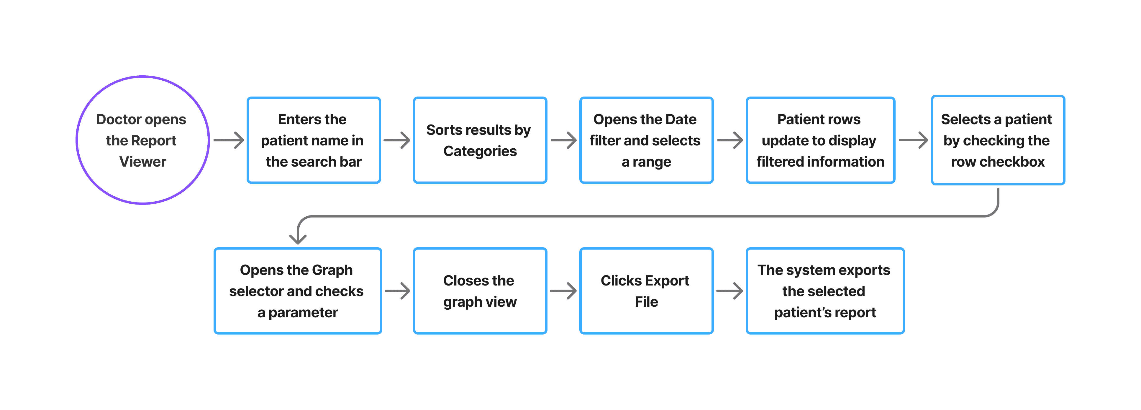
User Flow
I chose this Main scenario of the Doctor persona to illustrate how users efficiently filter, review, and export patient reports within the system.
Design Evolution
Mid-Fidelity Wireframe

Features Added During Iteration
Time Analyzer and Report view
New time analyzer feature, with details omitted for confidentiality, and the ability to open generated reports from the report generator app when needed.
Column Resize
Added resizable table columns to allow users to adjust column widths for better readability and a more comfortable data management experience.
High-Fidelity Wireframes
Light Mode
Dark Mode
Report Generator
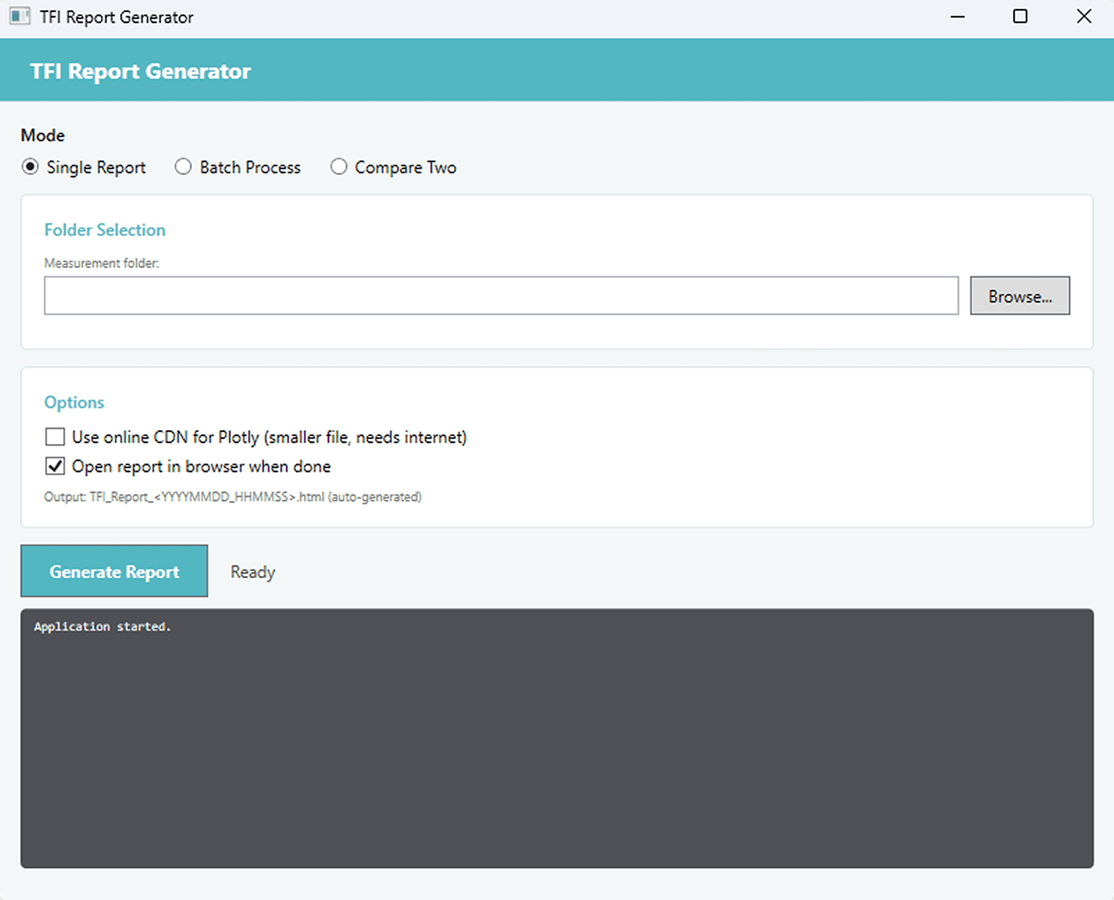
The Report Generator is a program that uses a calculation library to generate an HTML report for each patient, compiling and comparing eye examination data across multiple sessions.
Original Report Generator
Design Improvements
Refined text hierarchy and emphasized key information for better readability.
Modernized the visual design to replace the outdated interface.
Implemented a consistent light and dark mode design system.
New Workflow Features
Export options
Dropdown with multiple export methods, including email, giving users more flexibility when exporting reports, past analyses and historical data.
Data Workbook
New option to generate a file formatted and ready for use in the Data Workbook, supporting further analysis and review of examination data.
User Flow
I chose this scenario of a doctor persona scenario to illustrate the Report Generator’s core workflow.

High-Fidelity Wireframes
Light Mode
Dark Mode
Clinical Measurements Report
The Clinical Measurements Report Card is an HTML file generated from the Report Generator, containing comprehensive patient eye examination data. It includes medical information, parameter trends over time, eye layer map, video recording and a summary of clinical measurements for print.
Original Clinical Measurements Report
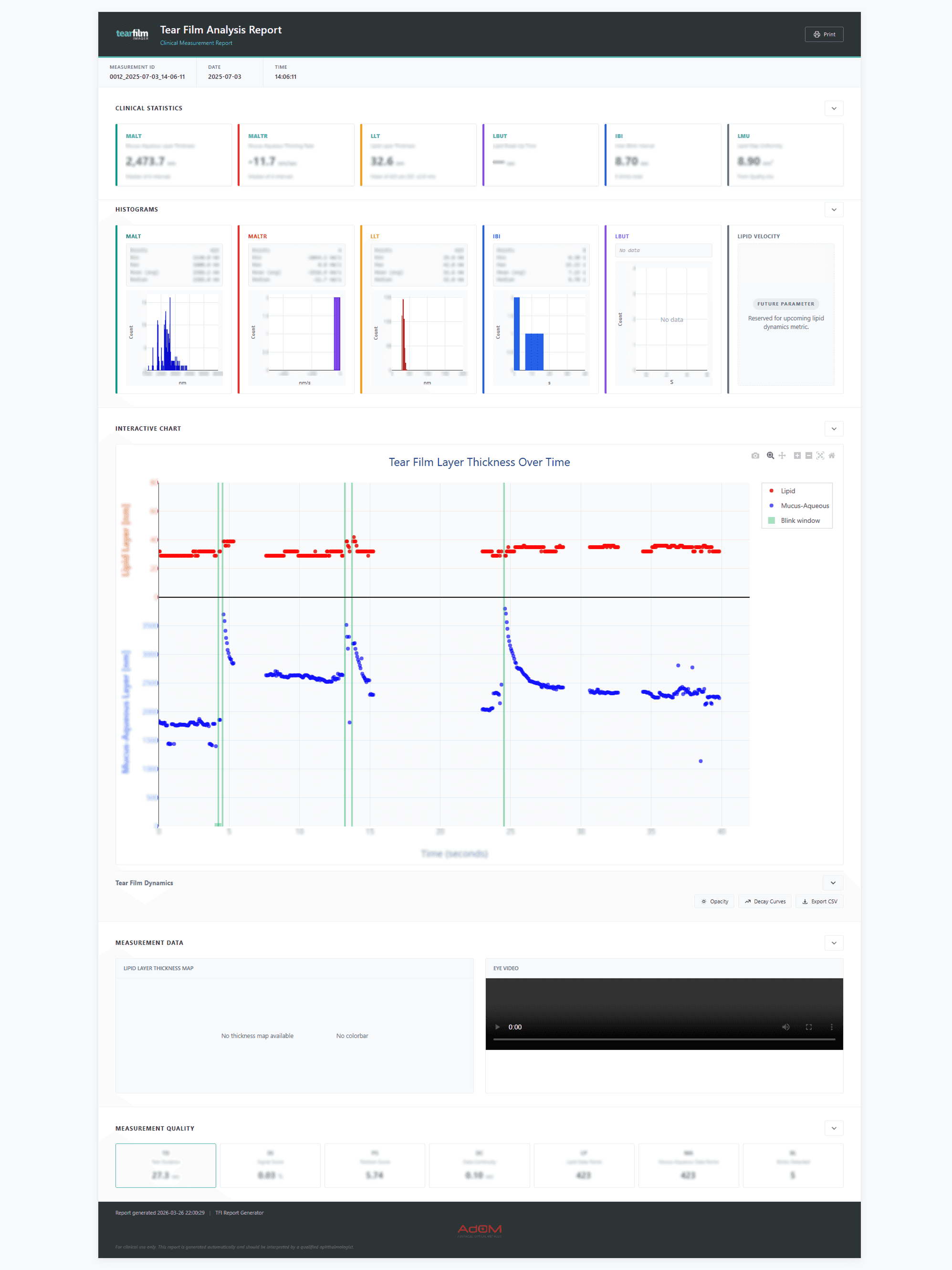
All patient data displayed is fictional
Design Improvements
Refined text hierarchy and emphasized key clinical information for better readability.
Improved layout of histograms and graphs for a more ergonomic and structured visualization.
Integrated layer thickness over time with its corresponding graph dynamics into a unified component.
Modernized the visual design to replace the outdated interface.
Implemented a consistent light and dark mode design system.
Light Mode

Dark Mode

TFI Workspace
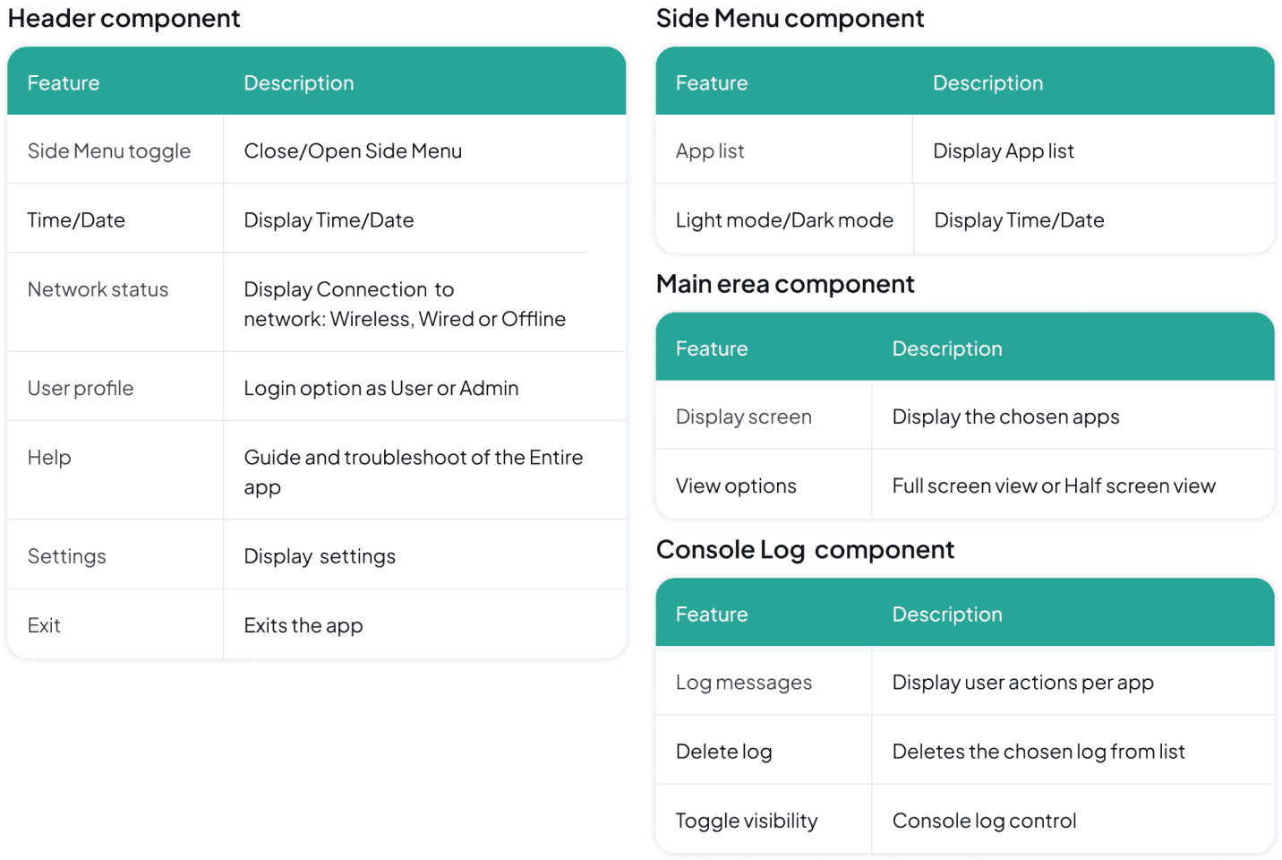
The Workspacen is a unified desktop and web-based application designed to manage TFI eye imaging systems for both User groups. It consists of a structured interface with a global header for system controls and User login, a side menu for navigation and Mode switch, a central workspace for running applications in single or split view and a console panel for system logs.
Features
Header component
Feature
Description
Side Menu toggle
Close/Open Side Menu
Time/Date
Display Time/Date
Network status
Display Connection to
network: Wireless, Wired or Offline
User profile
Login option as User or Admin
Help
Guide and troubleshoot of the Entire app
Settings
Display settings
Exit
Exits the app
Side Menu component
Feature
Description
App list
Display App list
Light mode/Dark mode
Display Time/Date
Main erea component
Feature
Description
Display screen
Display the chosen apps
View options
Full screen view or Half screen view
Console Log component
Feature
Description
Log messages
Display user actions per app
Delete log
Deletes the chosen log from list
Toggle visibility
Console log control
Information Architecture
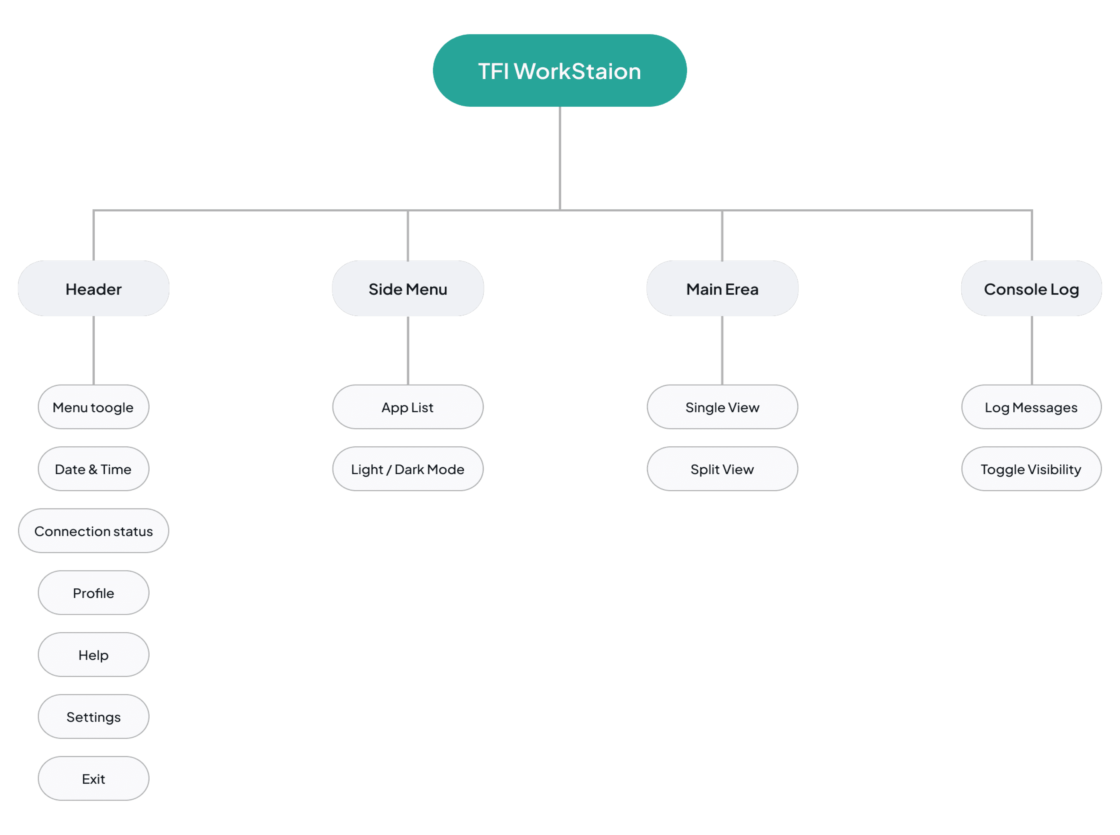
Auxiliary Tools
The secondary tools that support the user were placed under a separate dropdown in the menu, so the main navigation is not overloaded. They are not the tools the team reaches for every day, but they sit alongside the main applications and help when a case needs a closer look.
TOOL 01
CALIBRATION REPORT

Aligning the system to the corneal coordinates
The calibration report is used to calibrate the coordinates of the eye cornea. It takes the operator through the calibration steps and presents the measured values so the imaging system is aligned before any capture begins.
TOOL 02
BLINK DETECTION
Turning a patient eye video into blink statistics
Blink detection takes a recorded video of the patient’s eye and produces a full report of the blink behavior it finds. The statistics are laid out as diagrams across the length of the recording, instead of scrubbing through the footage.

TOOL 03
VIDEO ENHANCER

A 3D view of the eye for a closer examination
The video enhancer converts the 2D eye video into a 3D viewer. Doctors can change the angle and examine the surface from perspectives a flat recording cannot show, which makes it easier to examine the eye further.
Design Evolution
Low-Fidelity Wireframe

Design System Insights

High-Fidelity Wireframes
Light Mode
Dark Mode
Impact & Outcomes
1
Unified Workflow
Consolidated multiple tools into a single workstation, reducing fragmented workflows and improving efficiency for clinical users.
2
Improved Usability in Clinical Environments
Designed a dual-mode system optimized for both low-light examination settings and all-day usage, reducing visual strain and improving readability.
3
Enhanced Data Clarity
Reorganized reports, graphs, and tables to improve data interpretation and support faster clinical decision-making.
4
Scalable Design System
Established a consistent light and dark mode design system to support future tools and maintain UI consistency across the platform.
JUMP TO
TFI Workspace
Designed a unified workstation that improved the efficiency of managing a tear film analysis system.
Collaboration
1 Product Manager
1 Developer
1 COO
Tools Used


Introduction
The TFI product is a clinical tear film analysis platform used by ophthalmologists and technicians to review examinations, manage patient data, and generate clinical reports. The existing applications were already in use, but workflows, inconsistent interfaces, and limited support for clinical environments created opportunities to improve the overall experience.
Due to confidentiality, some product details and patient information have been omitted or anonymized. This case study focuses on the UX process, key design decisions, and selected parts of the final experience.
Context
The Goal
Designing a unified workstation application for multi device workflows by redesigning the existing apps and introducing new tools to better support user needs. Creating a consistent design system to improve usability and efficiency across the platform.
Target Users
Ophthalmologists managing patients analysis data and clinical reports
Technicians responsible for supporting and maintaining the workstation platform.
The Problem
The existing tools lacked visual clarity, usability, and consistency, while workflows were scattered across multiple applications. The platform also needed a dark mode-friendly interface optimized for low-light examination environments where eye analysis is performed.
Deliver
Review existing applications and identify workflow and usability issues.
Redesign existing applications and design new ones.
Create a scalable dual-mode design system..
Create a a dual-mode design system.
User Personas
Dr. Jennifer Wang
Ophthalmologists
Dark environment
Goals
Review and compare patient tear film analysis quickly.
Access clinical reports and measurements in one unified workplace.
Reduce visual strain during long examination sessions.
Frustrations
Switching between multiple disconnected
applications.
Poor readability and cluttered data visualizations.
Bright interfaces causing discomfort in dark
environments.
Needs
A clear and low-strain dark mode interface.
Fast access to patient analysis history and reports.
Consistent workflows across all workstation tools.
Daniel Ross
Technicians
Light environment
Goals
Monitor and manage examination data efficiently.
Support report generation and workflow operations.
Maintain stable and organized platform usage throughout the day.
Frustrations
Inconsistent UI patterns between tools.
Eye fatigue from high-brightness white interfaces.
Time wasted navigating complex workflows.
Needs
A balanced light mode with reduced glare.
Clear system organization and navigation.
Reliable and consistent interface behavior across applications.
The Mission
1
Unified clinical Environment
A centralized space that combines tear film analysis, reports, and clinical tools into one consistent platform, reducing fragmented workflows and improving usability.
2
Adaptive reporting & dual-mode system
A redesigned reporting ecosystem with light and dark mode experiences optimized for low-light examinations and all-day workstation usage.
Understanding the Challenge
The existing applications were functional but outdated and fragmented across separate interfaces. The redesign have to focused on modernizing and unifying the overall experience.
Report Viewer
The Report Viewer is a clinical application designed to organize and manage patient eye examination data and measurements, enabling doctors to efficiently filter, review, and export database records for each patient.
Original Report Viewer
Feature Evolution & Fixes
New Workflow Features
Add Filter
Added advanced filtering options to support scalable search and sorting workflows without overcrowding the default table controls. The feature keeps the interface organized while allowing future filter expansion.
Export File
Added advanced filtering options to support scalable search and sorting workflows without overcrowding the default table controls. The feature keeps the interface organized while allowing future filter expansion.
Delete File
Introduced file deletion functionality to support growing patient data volumes and improve long term table and report management workflows.
19
features audited
9
redesigned
6
relocated
4
removed
REDESIGNED
HIGH PRIORITY
Filtering lived in endless dropdowns
Hundreds of entries per dropdown, Min/Max date buttons nobody recognized, and no way to identify a row at a glance.
Solution: One search-first filter form with a calendar range picker.

REDESIGNED
HIGH PRIORITY
Seven statuses that looked identical
Document state carried no visual distinction at all.
Solution: A status system readable in one glance.
Reports status
RELOCATED
MEDIUM PRIORITY
Controls sat away from the data
Sorting and list views were buttons parked far from the table they acted on.
Solution: Moved into the table header, next to the rows they change.

RELOCATED
LOW PRIORITY
Graph tools in the global toolbar
Both only ever applied to the patient graphs.
Solution: Moved into the graph panel.
Quality
View trend
REMOVED
LOW PRIORITY
Developer leftovers in a clinical tool
A console log, an exit-the-app action, a per-label form selector and a help link that never opened in context - none of it belonged in a clinician’s workflow.
Solution: Cut entirely.
Use for each label
Action (exit)
Console
Help
Color Inspiration
Light Mode
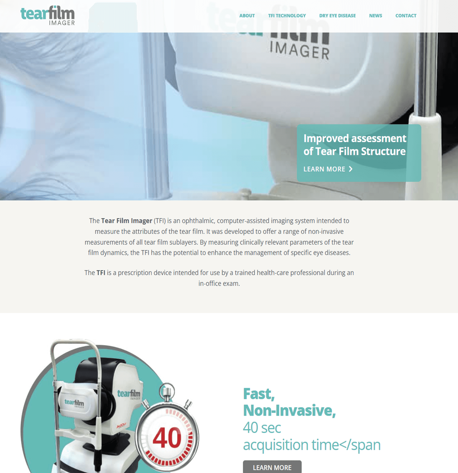
I used the primary color of the Tear Film Imager site brand, incorporating lighter surfaces with dark text to maintain readability while avoiding harsh pure white backgrounds.
Dark Mode
Although AdOM's brand color is red, I chose not to use it as the primary color since red is reserved for semantic states like errors and alerts. Inspired by competitor platforms, I adopted an azure blue paired with dark surfaces and light text to improve readability and reduce eye strain in low-light clinical environments.

User Flow
I chose this Main scenario of the Doctor persona to illustrate how users efficiently filter, review, and export patient reports within the system.
Design Evolution
Mid-Fidelity Wireframe
High-Fidelity Wireframes
Light Mode
Dark Mode
Features Added During Iteration
Time Analyzer and Report view
Added a time analyzer feature, with details omitted for confidentiality, and the ability to open generated reports from the report generator app when needed.
Column Resize
Added resizable table columns to allow users to adjust column widths for better readability and a more comfortable data management experience.
Report Generator
The Report Generator is a program that uses a calculation library to generate an HTML report for each patient, compiling and comparing eye examination data across multiple sessions.
Original Report Generator
Design Improvements
Refined text hierarchy and emphasized key information for better readability.
Modernized the visual design to replace the outdated interface.
Implemented a consistent light and dark mode design system.
New Workflow Features
Export options
Dropdown with multiple export methods, including email, giving users more flexibility when exporting reports, past analyses and historical data.
Data Workbook
New option to generate a file formatted and ready for use in the Data Workbook, supporting further analysis and review of examination data.

Light Mode

Dark Mode
High-Fidelity Wireframes
User Flow
I chose this scenario of a doctor persona scenario to illustrate one of the Report Generator’s core workflow.

Clinical Measurements Report
The Clinical Measurements Report Card is an HTML file generated from the Report Generator, containing comprehensive patient eye examination data. It includes medical information, parameter trends over time, eye layer map, video recording and a summary of clinical measurements for print.
All patient data displayed is fictional
All patient data displayed is fictional
Original Clinical Measurements Report
Design Improvements
Refined text hierarchy and emphasized key clinical information for better readability.
Improved layout of histograms and graphs for a more ergonomic and structured visualization.
Integrated layer thickness over time with its corresponding graph dynamics into a unified component.
Modernized the visual design to replace the outdated interface.
Implemented a consistent light and dark mode design system.
Light Mode
Dark Mode
1
Unified Workflow
A centralized workstation that combines tear film analysis, reports, and clinical tools into one consistent platform, reducing fragmented workflows and improving usability.
2
Improved Usability in Clinical Environments
A redesigned reporting ecosystem with light and dark mode experiences optimized for low-light examinations and all-day workstation usage.
3
Enhanced Data Clarity
Reorganized reports, graphs, and tables to improve data interpretation and support faster clinical decision-making.
4
Scalable Design System
Established a consistent light and dark mode design system to support future tools and maintain UI consistency across the platform.
Impact & Outcomes
TFI Workspace
The Workspace is a unified desktop and web-based application designed to manage TFI eye imaging systems for both User groups. It consists of a structured interface with a global header for system controls and User login, a side menu for navigation and Mode switch, a central workspace for running applications in single or split view and a console panel for system logs.
Features

Information Architecture

Design Evolution
Low-Fidelity Wireframe

Design System Insights
High-Fidelity Wireframes
Light Mode
Dark Mode
Auxiliary Tools
The secondary tools that support the user were placed under a separate dropdown in the menu, so the main navigation is not overloaded. They are not the tools the team reaches for every day, but they sit alongside the main applications and help when a case needs a closer look.
TOOL 01
CALIBRATION REPORT
Aligning the system to the corneal coordinates
The calibration report is used to calibrate the coordinates of the eye cornea. It takes the operator through the calibration steps and presents the measured values so the imaging system is aligned before any capture begins.
TOOL 02
BLINK DETECTION
Turning a patient eye video into blink statistics
Blink detection takes a recorded video of the patient’s eye and produces a full report of the blink behavior it finds. The statistics are laid out as diagrams across the length of the recording, instead of scrubbing through the footage.
TOOL 03
VIDEO ENHANCER
A 3D view of the eye for a closer examination
The video enhancer converts the 2D eye video into a 3D viewer. Doctors can change the angle and examine the surface from perspectives a flat recording cannot show, which makes it easier to examine the eye further.
TFI Workspace
Designed a unified workstation that improved the efficiency of managing a tear film analysis system.
Collaboration
1 Product Manager
1 Developer
1 COO
Tools Used



Introduction
The TFI product is a clinical tear film analysis platform used by ophthalmologists and technicians to review examinations, manage patient data, and generate clinical reports. The existing applications were already in use, but workflows, inconsistent interfaces, and limited support for clinical environments created opportunities to improve the overall experience.
Due to confidentiality, some product details and patient information have been omitted or anonymized. This case study focuses on the UX process, key design decisions, and selected parts of the final experience.
Context
The Goal
Designing a unified workstation application for multi device workflows by redesigning the existing apps and introducing new tools to better support user needs. Creating a consistent design system to improve usability and efficiency across the platform.
Target Users
Ophthalmologists managing patients analysis data and clinical reports
Technicians responsible for supporting and maintaining the workstation platform.
The Problem
The existing tools lacked visual clarity, usability, and consistency, while workflows were scattered across multiple applications. The platform also needed a dark mode-friendly interface optimized for low-light examination environments where eye analysis is performed.
Deliver
Reworking and redesigning the Report Viewer application
Redesigning the Clinical Measurements Report.
Redesigning the Report Generator application.
Creating a dual-mode design system.
Building a unified workspace experience.
Understanding the Challenge
The existing applications were functional but outdated and fragmented across separate interfaces. The redesign have to focused on modernizing and unifying the overall experience.
User Personas
Dr. Jennifer Wang
Ophthalmologists Dark environment
Goals
Review and compare patient tear film analysis quickly.
Access clinical reports and measurements in one unified workplace.
Reduce visual strain during long examination sessions.
Frustrations
Switching between multiple disconnected applications.
Poor readability and cluttered data visualizations.
Bright interfaces causing discomfort in dark environments.
Needs
A clear and low-strain dark mode interface.
Fast access to patient analysis history and reports.
Consistent workflows across all workstation tools.
Daniel Ross
Technicians
Light environment
Goals
Monitor and manage examination data efficiently.
Support report generation and workflow operations.
Maintain stable and organized platform usage throughout the day.
Frustrations
Inconsistent UI patterns between tools.
Eye fatigue from high-brightness white interfaces.
Time wasted navigating complex workflows.
Needs
A balanced light mode with reduced glare.
Clear system organization and navigation.
Reliable and consistent interface behavior across applications.
The Mission
1
Unified clinical Environment
A centralized space that combines tear film analysis, reports, and clinical tools into one consistent platform, reducing fragmented workflows and improving usability.
2
Adaptive reporting & dual-mode
system
A redesigned reporting ecosystem with light and dark mode experiences optimized for low-light examinations and all-day workstation usage.
Report Viewer
The Report Viewer is a clinical application designed to organize and manage patient eye examination data and measurements, enabling doctors to efficiently filter, review, and export database records for each patient.
Original Report Viewer
Feature Evolution & Fixes
New Workflow Features
Add Filter
Added advanced filtering options to support scalable search and sorting workflows without overcrowding the default table controls. The feature keeps the interface organized while allowing future filter expansion.
Export File
Added advanced filtering options to support scalable search and sorting workflows without overcrowding the default table controls. The feature keeps the interface organized while allowing future filter expansion.
Delete File
Introduced file deletion functionality to support growing patient data volumes and improve long term table and report management workflows.
Color Inspiration
Light Mode
I used the primary color of the Tear Film Imager site brand, incorporating lighter surfaces with dark text to maintain readability while avoiding harsh pure white backgrounds.

Dark Mode
Although AdOM's brand color is red, I chose not to use it as the primary color since red is reserved for semantic states like errors and alerts. Inspired by competitor platforms, I adopted an azure blue paired with dark surfaces and light text to improve readability and reduce eye strain in low-light clinical environments.
User Flow
I chose this Main scenario of the Doctor persona to illustrate how users efficiently filter, review, and export patient reports within the system.
Design Evolution
Mid-Fidelity Wireframe
High-Fidelity Wireframes
Light Mode
Dark Mode
Features Added During Iteration
Time Analyzer and Report view
Added a time analyzer feature, with details omitted for confidentiality, and the ability to open generated reports from the report generator app when needed.
Column Resize
Added resizable table columns to allow users to adjust column widths for better readability and a more comfortable data management experience.
Report Generator
The Report Generator is a program that uses a calculation library to generate an HTML report for each patient, compiling and comparing eye examination data across multiple sessions.
Original Report Generator
Design Improvements
Refined text hierarchy and emphasized key information for better readability.
Modernized the visual design to replace the outdated interface.
Implemented a consistent light and dark mode design system.
New Workflow Features
Export options
Dropdown with multiple export methods, including email, giving users more flexibility when exporting reports, past analyses and historical data.
Data Workbook
New option to generate a file formatted and ready for use in the Data Workbook, supporting further analysis and review of examination data.
Light Mode
Dark Mode
High-Fidelity Wireframes
User Flow
I chose this scenario of a doctor persona scenario to illustrate the Report Generator’s core workflow.

Clinical Measurements Report
The Clinical Measurements Report Card is an HTML file generated from the Report Generator, containing comprehensive patient eye examination data. It includes medical information, parameter trends over time, eye layer map, video recording and a summary of clinical measurements for print.

All patient data displayed is fictional
All patient data displayed is fictional
Original Clinical Report
Design Improvements
Refined text hierarchy and emphasized key clinical information for better readability.
Improved layout of histograms and graphs for a more ergonomic and structured visualization.
Integrated layer thickness over time with its corresponding graph dynamics into a unified component.
Modernized the visual design to replace the outdated interface.
Implemented a consistent light and dark mode design system.
Light Mode
Dark Mode
Impact & Outcomes
1
Unified Workflow
Consolidated multiple tools into a single workstation, reducing fragmented workflows and improving efficiency for clinical users.
2
Improved Usability in Clinical Environments system
A redesigned reporting ecosystem with light and dark mode experiences optimized for low-light examinations and all-day workstation usage.
3
Enhanced Data Clarity
Reorganized reports, graphs, and tables to improve data interpretation and support faster clinical decision-making.
4
Scalable Design System
Established a consistent light and dark mode design system to support future tools and maintain UI consistency across the platform.
TFI Workspace
The Workspace is a unified desktop and web-based application designed to manage TFI eye imaging systems for both User groups. It consists of a structured interface with a global header for system controls and User login, a side menu for navigation and Mode switch, a central workspace for running applications in single or split view and a console panel for system logs.
Features
Information Architecture
Design Evolution
Low-Fidelity Wireframe

Design System Insights

High-Fidelity Wireframes
Light Mode
Dark Mode
Auxiliary Tools
The secondary tools that support the user were placed under a separate dropdown in the menu, so the main navigation is not overloaded. They are not the tools the team reaches for every day, but they sit alongside the main applications and help when a case needs a closer look.