Artur’s Portfolio

Crypto Casino
Redesigning a live crypto casino into a consistent, readable and mobile-ready product.
Collaboration
1 Developer
1 Stake Holder
Tools Used


Introduction
The product is a live crypto casino platform built on a dark purple visual system, combining a game lobby, a player account panel and a set of in house games. The product was already in production, but it but it lacked the visual consistency, research foundation, and marketing direction needed to succeed.
Due to confidentiality, I cannot share every detail of the project. This case study focuses on research and selected insights, while the mascot, brand and games are presented anonymously.
Understanding the Challenge
The product had an alpha version. The redesign had to improve a product people were using, inside the constraints of an existing codebase and a small team.
Context
The Goal
Designing a live crypto casino to be a consistent, readable and mobile-ready and working product, to be shipped and in daily use.

The problem
The product looked generic compared with competitors and lacked the trust and loyalty signals needed to keep players coming back.

The user challenge
Unreliable UI, inconsistent feature placement, and cramped and small game rooms made the product difficult to use, especially on mobile.

My role
Research and product review
Create a design system
Redesign & develop motion concepts
Hand off the designs to the developer.

Design objectives
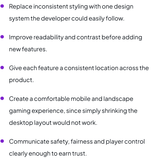
Replace inconsistent styling with one design system the developer could easily follow.
Improve readability and contrast before adding new features.
Give each feature a consistent location across the product.
Create a comfortable mobile and landscape gaming experience, since simply shrinking the desktop layout would not work.
Communicate safety, fairness and player control clearly enough to earn trust.
Research
Three casino case studies, five competitor sites, published player reviews and a SWOT analysis - run on a FigJam board and reduced to the findings that changed the design.
Casino case studies reviewed
UI
Live dealer casino games
Interface density that still works on both desktop and phone the reference for how much a game room can hold.
FRONT-END
Building a sports betting exchange
Where a betting interface breaks in build and which decisions have to be settled before handoff.
UX
Gamification & player retention
Retention built on player motivation rather than financial incentives the argument behind the membership system.
Competitor analysis
Site
Type
What it showed
1Xbet
Global cookie cutter operator
The template most banned, market sites share proof that a generic layout is the default, not a requirement.
bet365
Casino and games operator
A dense lobby that still stays navigable and top statistics given real prominence.
jvcbet
Localized (IL) version
How a localized build handles language and direction without a separate product.
NetEnt
Games provider
Catalogue presentation and demo play how games are introduced before a player commits.
Stake
Crypto casino
The closest direct comparison: originals, provably fair play and crypto native onboarding.
Live game rooms appear in 3 of the 5 competitors, our product has none.
A loyalty or ranking system appears in 3 of 5, but a membership tier system in almost none.
Only 1 of 5 offers anonymous registration, which a crypto product can turn into an advantage.
In 2 of 5 reviewed sites, many actions were not understandable without trial and error.
User and product reviews
Published operator reviews were read alongside the competitor sites to see what players and reviewers actually judge an online casino on bonuses, fairness, security and how clearly an operator explains them.
Thrill Casino review - CryptoSlate
Bonuses, fairness and security, provably fair originals and multi-network stable coin support.

Stake review - Punter2Pro
How a crypto-native operator is judged on payouts, originals and account handling.

bet365 Casino review - PlayMichigan
What a regulated mainstream operator is expected to explain up front.

Shuffle Casino review - Webopedia
How crypto casinos are compared on trust signals rather than game count.

SWOT analysis
Strengths
The mobile design already includes safe areas and touch-friendly targets.
The purple brand color feels premium and is a strong psychological choice for a luxury casino product.
Player control tools already exist and can be built on.
The membership and ranking system is uncommon among competitors.
Weaknesses
No live game rooms, unlike 3 of 5 competitors.
Generic UI kit components weaken the luxury positioning.
The wallet lacks analytics and transaction insight, weakening trust.
Important statistics are not highlighted clearly and the product lacks engaging motion
Opportunities
Open Graph tags, descriptive links and image alt text.
An analytics pixel, missing on 2 of 5 competitors.
A landscape-mode for mobile, missing on 4 of 5.
An owned niche, for example a brand mascot for a stronger brand identity.
Threats
Dark mode only is not optimised for outdoor play.
Players leave without a structured loyalty system.
Crypto users may expect fast anonymous registration and flexible payment options.
Easy access to support is missing which may cause players to leave when they need help.
Research insights that shaped the redesign
Contrast was a measurable failure, not a preference , 18 of 81 elements failed a WCAG AA contrast check.
Dark mode only was a competitive assumption rather than a user requirement, and it fails outdoors.
Nothing on the site moved: no animation, carousel or scroll behaviour to hold attention between actions.
Trust lives in the wallet without transaction insight, players lose the sense of being in control.
Mobile was the strongest existing asset, landscape gameplay was the real gap.
Product Review
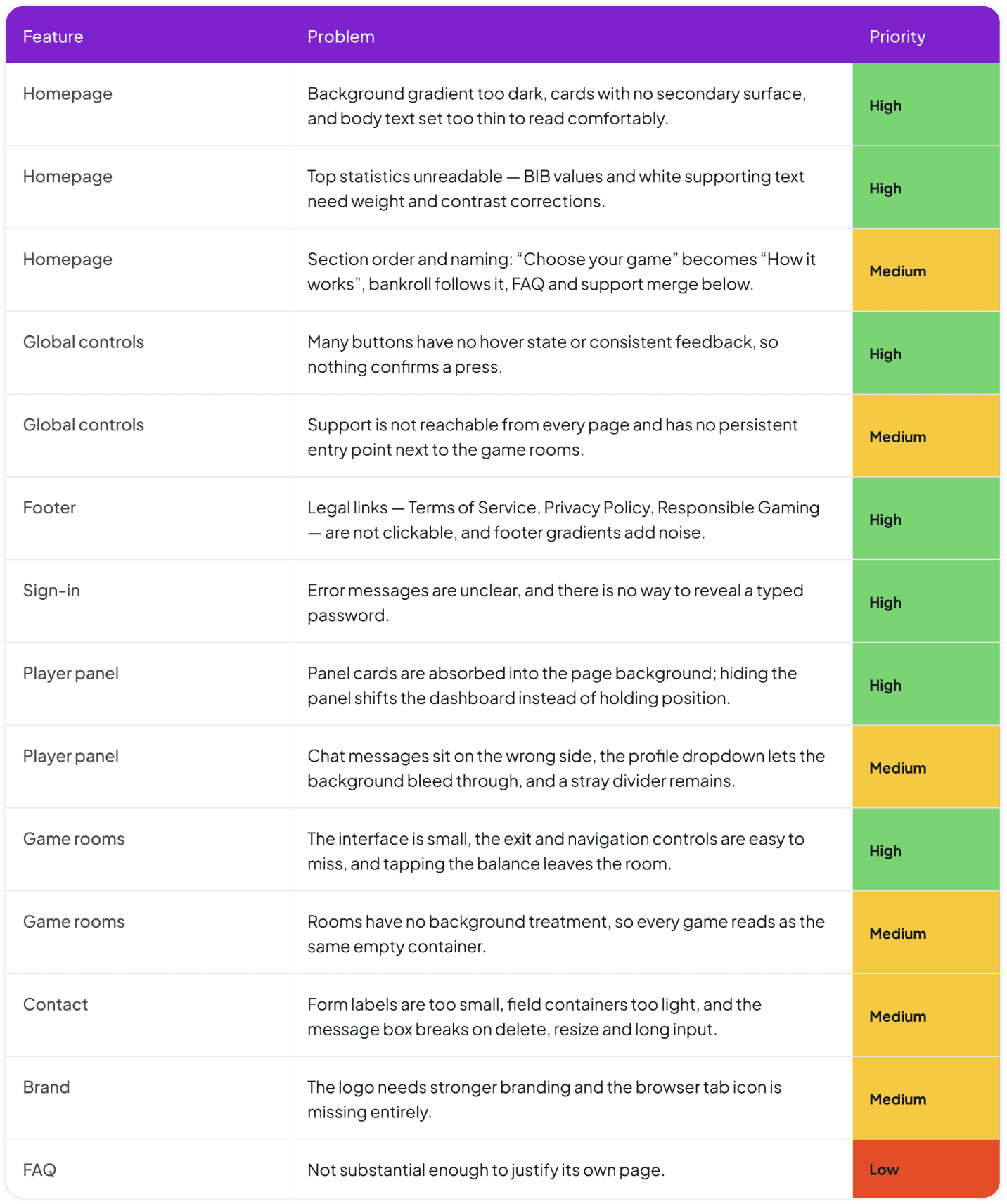
The live product was reviewed page by page and every issue was documented on the board. The findings were split into interface and search visibility problems then prioritized with the developer to decide what should be fixed first.
The Original product
Screens of the Main pages and one game as it was reviewed.
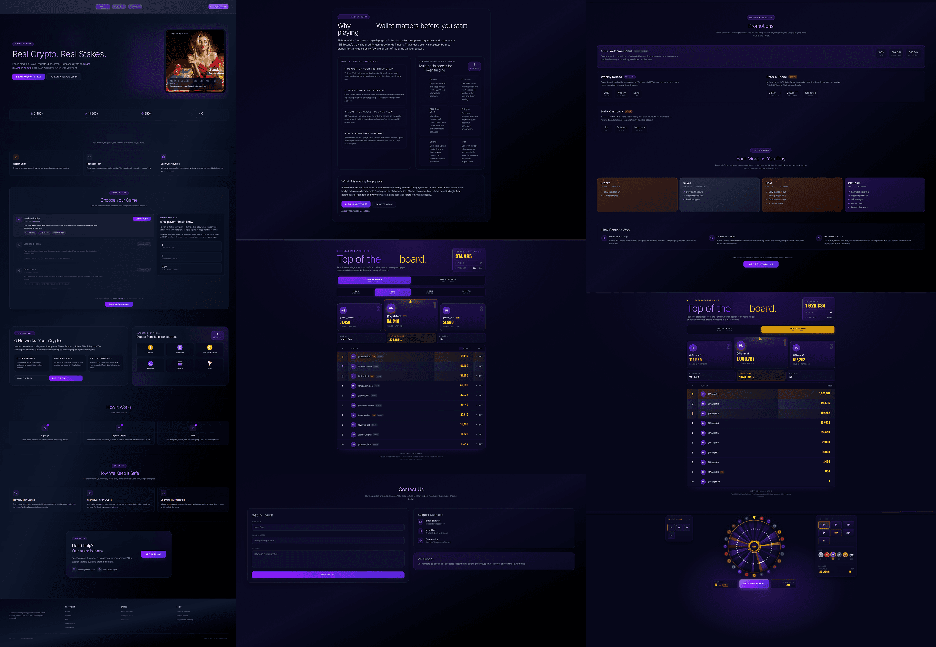
Screens of the Sidepanel pages as it was reviewed.

Website UI fixes
Feature
Problem
Priority
Homepage
Background gradient too dark, cards with no secondary surface, and body text set too thin to read comfortably.
High
Homepage
Top statistics unreadable — BIB values and white supporting text need weight and contrast corrections.
High
Homepage
Section order and naming: “Choose your game” becomes “How it works”, bankroll follows it, FAQ and support merge below.
Medium
Global controls
Many buttons have no hover state or consistent feedback, so nothing confirms a press.
High
Global controls
Support is not reachable from every page and has no persistent entry point next to the game rooms.
Medium
Footer
Legal links — Terms of Service, Privacy Policy, Responsible Gaming are not clickable, and footer gradients add noise.
High
Sign-in
Error messages are unclear, and there is no way to reveal a typed password.
High
Player panel
Panel cards are absorbed into the page background; hiding the panel shifts the dashboard instead of holding position.
High
Player panel
Chat messages sit on the wrong side, the profile dropdown lets the background bleed through, and a stray divider remains.
Medium
Game rooms
The interface is small, the exit and navigation controls are easy to miss, and tapping the balance leaves the room.
High
Game rooms
Rooms have no background treatment, so every game reads as the same empty container.
Medium
Contact
Form labels are too small, field containers too light, and the message box breaks on delete, resize and long input.
Medium
Brand
The logo needs stronger branding and the browser tab icon is missing entirely.
Medium
FAQ
Not substantial enough to justify its own page.
Low
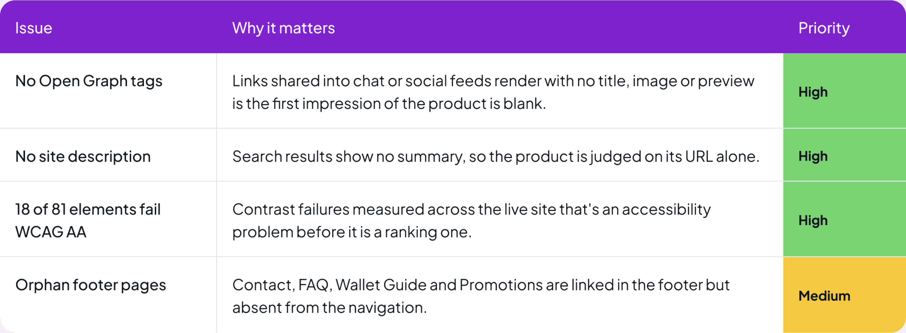
Website SEO fixes
Issue
Why it matters
Priority
No Open Graph tags
Links shared into chat or social feeds render with no title, image or preview is the first impression of the product is blank.
High
No site description
Search results show no summary, so the product is judged on its URL alone.
High
18 of 81 elements fail WCAG AA
Contrast failures measured across the live site that's an accessibility problem before it is a ranking one.
High
Orphan footer pages
Contact, FAQ, Wallet Guide and Promotions are linked in the footer but absent from the navigation.
Medium
The most urgent problems
Readability before anything else
A measured contrast failure across a fifth of the site made every other improvement unreliable.
Feedback players can feel
Buttons without hover or pressed states leave players unsure whether their actions had registered.
Game rooms that fit the screen
Small controls and an easy to miss exit made accidental exits more likely, especially on mobile.
Trust the product never states
Broken legal links and limited wallet transaction details weakened confidence in the product.
New Design System
One token layer for color, type, spacing, radius, surfaces and effects, built so a fix could be made once and hold everywhere.
Core tokens

What the system changed
Contrast became a rule, not a judgement call
Text and surface tokens are paired so components cannot be built with combinations that fail a contrast check.
One name per decision
The developer and I replaced informal descriptions of colours and sizes with shared token names which reduced handoff confusion.
Radius and spacing carry meaning
Radius defines whether a surface is a control, card or modal while one spacing scale creates a consistent rhythm across every page.
Effects are state, not decoration
Glows were reduced to three tokens linked to focus, reward and active states so motion and light always have a clear purpose.
Redesigned Product
The redesign in three groups: the homepage and its major sections, the player account side panel and the game rooms themselves.
Homepage and major sections
VIEW 01
HERO & SIGN-UP

A clear and engaging first impression
The landing page opens with the most important information and draws players in through the brand’s unique visual style. The page then guides them through a sign-up CTA, an animated wallet explanation, a short safety guide and a preview of the game collection.
VIEW 02
QNA & FOOTER

Help that is reachable, and legal links that work
The FAQ was moved to a separate page so the landing page would stay focused and easier to scroll. Support was given a clear entry point while the footer legal links became functional and the unnecessary gradients were removed.
VIEW 03
SIGNED-IN & WALLET GUIDE
Guiding players from wallet setup to continued engagement
After signing in, players are introduced to a clear CTA that opens a visual guide for creating and using the crypto wallet. The page also includes engaging features such as a ranking system and reward tables to encourage continued play.

VIEW 04
HOME PAGE

The main player home after sign-in
The home page becomes the main control center. It gives quick access to games, alerts, rewards, profile settings and other player tools. Some parts cannot be shown, so this focuses on the overall structure and key insights from the page.
VIEW 05
GAMES LOBBY
A lobby you can narrow before you scroll
A seven-category selector makes the lobby easier to browse, helping players filter the game collection before scrolling through the full list.

Account side panel
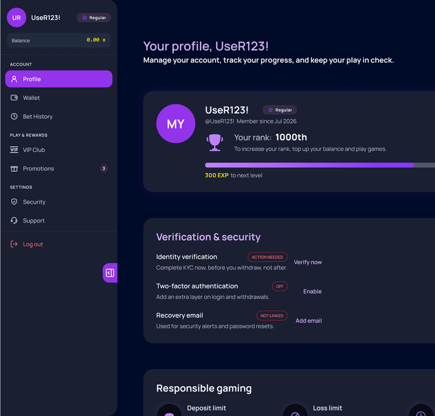
Seven pages behind one panel, each helping players organize and access the important information they need in one place.

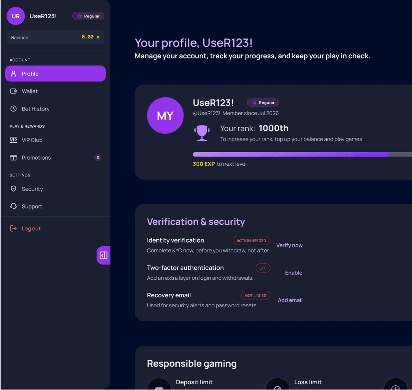
Profile
Identity, rank progress and verification sit in one column, with responsible gaming controls kept visible instead of buried.
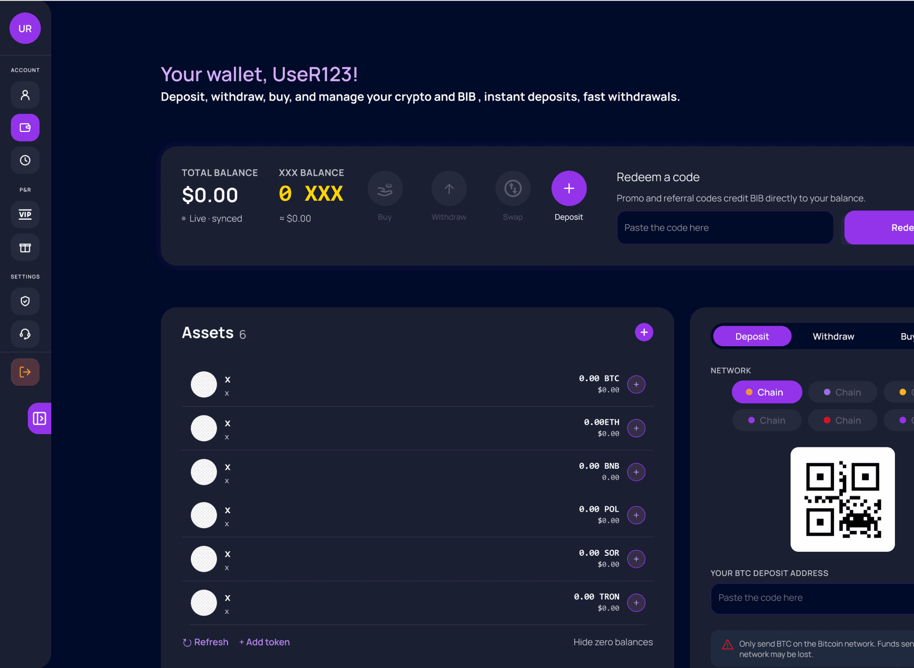
Wallet
Balance and key actions come first, followed by secondary options and transaction history so players can quickly understand and manage their money.

Bet History
A readable table card so a player can audit their own play. The old build gave no way to review past bets at all.

VIP Club
Four tiers with explicit benefit lists, giving the loyalty structure most competitors already have and this product did not.
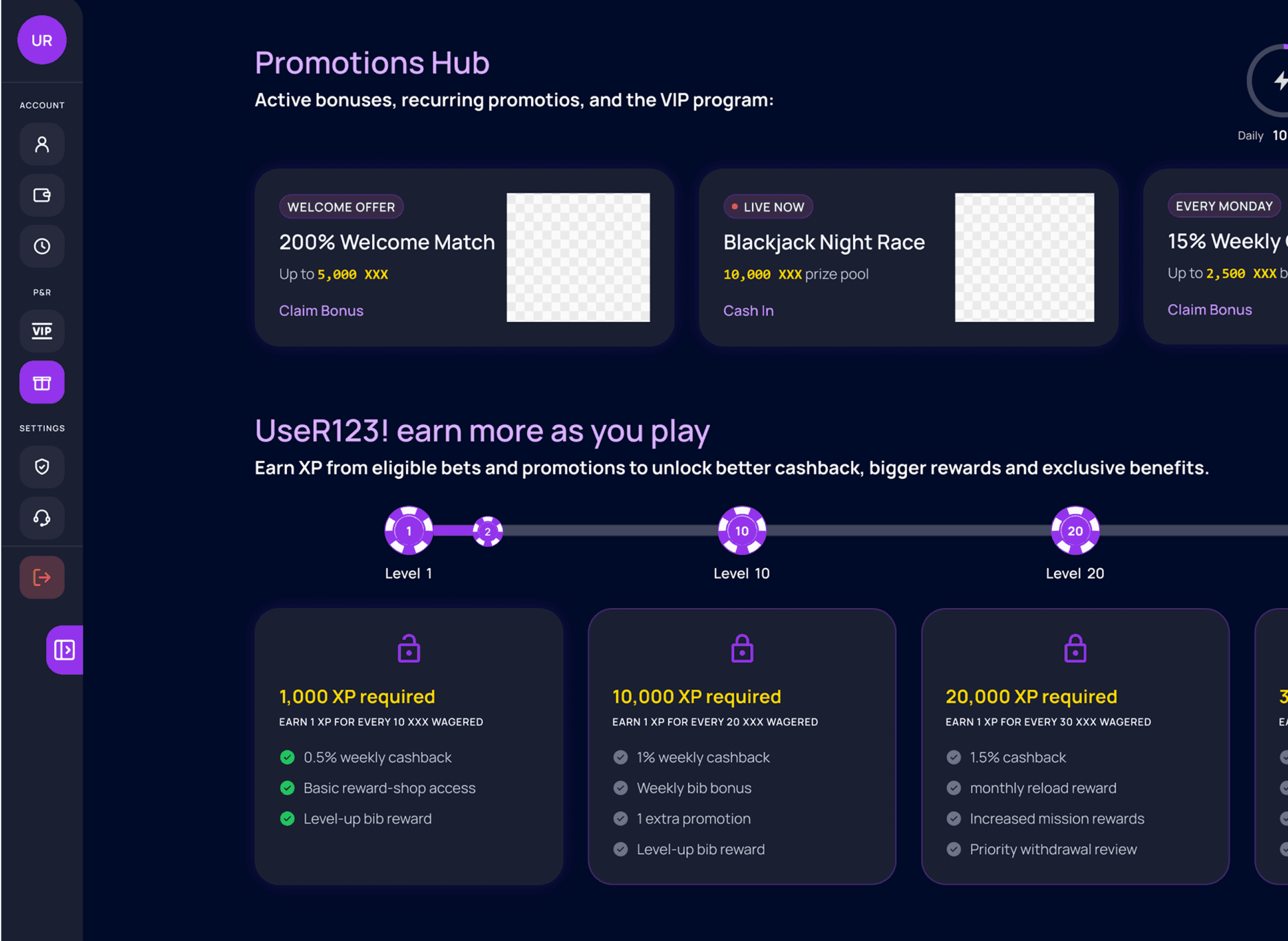
Promotions
Featured offers with live progress, daily, weekly and monthly timers so an offer’s deadline is never guessed at.
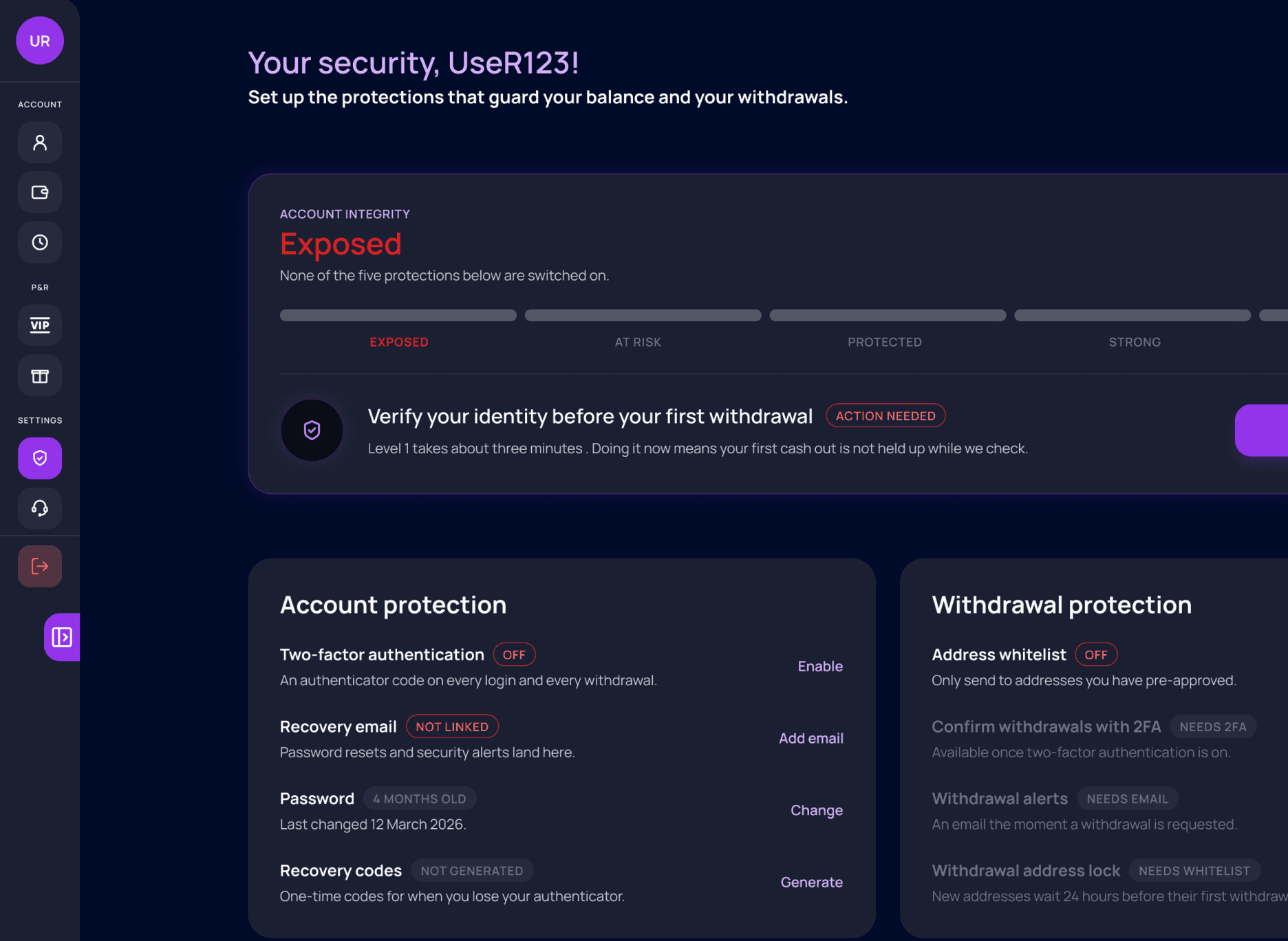
Security
Five security levels encourage players to strengthen their account step by step, supported by a global security score that shows their overall protection level
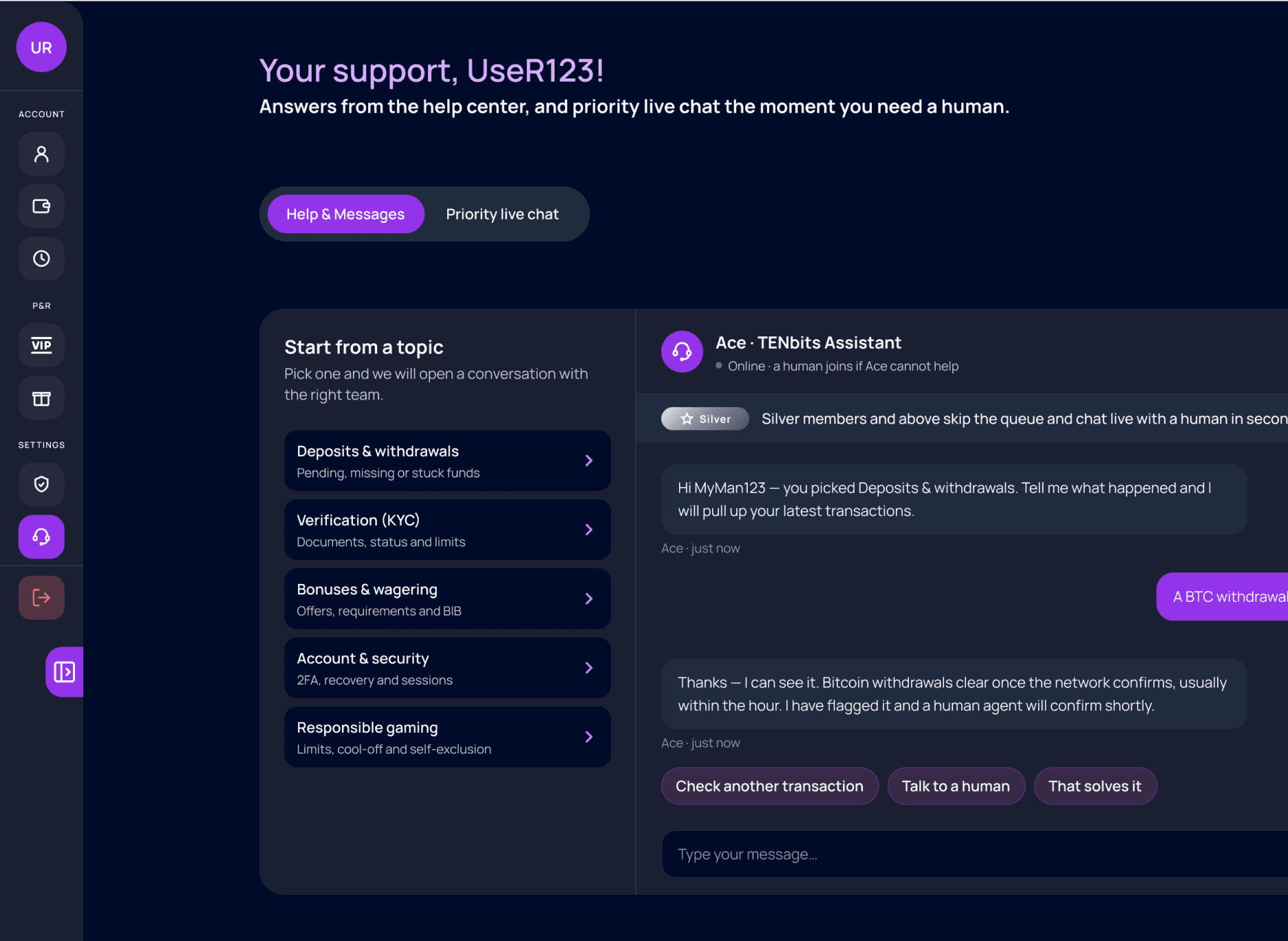
Support
Help-center chat is available to every player with priority live support for Silver members and above, providing faster assistance when needed.
Casino games
The game rooms rebuilt around the same rule: the table is the interface, and every control has to be findable without leaving the game.
GAME 01
CRASH

A multiplier you can read at a glance
The graph panel was redesigned with a clearer curve, stronger visual contrast, making it easier for players to follow the game and understand the number they are betting against as it changes.
GAME 02
SPEEN THE WHEEL
The wheel keeps the center to itself
Recent spins, targes and chip value moved out to the rails so nothing crowds the spin, and the bottom bar reads in the order a round happens: stake, spin, maximum win.

GAME 03
CARD ROOM
A table that fills the screen it is given
Controls moved to the edges of the felt and the balance was separated from the exit, fixing a review finding where tapping the amount dropped players out of the room.

GAME 04
LIVE CASINO ROOM

Eight seats without crowding the table
A centered oval with seat pods on a ring keeps every player, stake and timer readable at eight seats the felt was rebuilt for the layout rather than scaled down.
Mobile Experience
Casino play often happens away from a desk, on a commute, in a queue or on the sofa. The game room needs to stay clear in one hand, work smoothly when the screen rotates and always show the player that the game is activ
Why mobile and landscape decide the experience
Play away from a desktop
Sessions can be short and mobile. If a game room only works well at desktop size, the experience becomes limited on the go.

Rotation is part of the game
Players often turn their phone during a round. The layout should adapt smoothly instead of fighting the rotation, especially since less competitors offered an orientation.

Loading is a trust moment
A round involves the player’s balance. If nothing happens while loading, it can feel like something went wrong, so every room clearly shows its loading state.
Four Categories, portrait to landscape
MOBILE 01
SLOTS ROOMS
Loading state

MOBILE 02
WHEEL ROOMS
Loading state

MOBILE 03
CARD ROOMS
MOBILE 04
CASINO ROOMS
Loading state
Loading state
Impact & Outcomes
1
Consistency through one system
Colour, type, spacing, radius and effects became named tokens, so a change is made once and holds across every page and game room.
2
Readability and accessibility
Contrast moved from a judgement call to a rule of the token layer, addressing the measured WCAG failures found in the review.
3
A clearer product hierarchy
Sections were reordered around how players actually meet the product, and thin pages were merged into the surfaces that already earn a visit.
4
Mobile and landscape gameplay
Rooms were rebuilt for rotation rather than scaled down, with loading states that hold their layout instead of shifting under a finger.
5
Trust and security communication
Legal links work, security controls sit where players look for them, and the wallet shows the transaction history that confidence depends on.
6
Designer–developer collaboration
Disagreements were resolved with evidence or by re-hosting a feature, and the token names gave both sides one vocabulary for handoff.
Introduction
The product is a live crypto casino platform built on a dark purple visual system, combining a game lobby, a player account panel and a set of in house games. The product was already in production, but it but it lacked the visual consistency, research foundation, and marketing direction needed to succeed.
Due to confidentiality, I cannot share every detail of the project. This case study focuses on research and selected insights, while the mascot, brand and games are presented anonymously.
Crypto Casino
Redesigning a live crypto casino into a consistent, readable and mobile-ready product.
Collaboration
1 Developer
1 Stake Holder
Tools Used


Understanding the Challenge
The product had an alpha version. The redesign had to improve a product people were using, inside the constraints of an existing codebase and a small team.
Context

Design objectives
Replace inconsistent styling with one design system the developer could easily follow.
Improve readability and contrast before adding new features.
Give each feature a consistent location across the product.
Create a comfortable mobile and landscape gaming experience, since simply shrinking the desktop layout would not work.
Communicate safety, fairness and player control clearly enough to earn trust.
Research
Three casino case studies, five competitor sites, published player reviews and a SWOT analysis - run on a FigJam board and reduced to the findings that changed the design.
Casino case studies reviewed

Competitor analysis

Live game rooms appear in 3 of the 5 competitors, our product has none.
A loyalty or ranking system appears in 3 of 5, but a membership tier system in almost none.
Only 1 of 5 offers anonymous registration, which a crypto product can turn into an advantage.
In 2 of 5 reviewed sites, many actions were not understandable without trial and error.
User and product reviews
Published operator reviews were read alongside the competitor sites to see what players and reviewers actually judge an online casino on bonuses, fairness, security and how clearly an operator explains them.
Thrill Casino review - CryptoSlate
Bonuses, fairness and security, provably fair originals and multi-network stable coin support.
Stake review - Punter2Pro
How a crypto-native operator is judged on payouts, originals and account handling.
bet365 Casino review - PlayMichigan
What a regulated mainstream operator is expected to explain up front.
Shuffle Casino review - Webopedia
How crypto casinos are compared on trust signals rather than game count.
SWOT analysis

Research insights that shaped the redesign
Contrast was a measurable failure, not a preference , 18 of 81 elements failed a WCAG AA contrast check.
Dark mode only was a competitive assumption rather than a user requirement, and it fails outdoors.
Nothing on the site moved: no animation, carousel or scroll behaviour to hold attention between actions.
Trust lives in the wallet without transaction insight, players lose the sense of being in control.
Mobile was the strongest existing asset, landscape gameplay was the real gap.
Product Review
The live product was reviewed page by page and every issue was documented on the board. The findings were split into interface and search visibility problems then prioritized with the developer to decide what should be fixed first.
The Original product
Screens of the Main pages and one game as it was reviewed.
Screens of the Sidepanel pages as it was reviewed.
Website UI fixes

Website SEO fixes
The most urgent problems

New Design System
One token layer for color, type, spacing, radius, surfaces and effects, built so a fix could be made once and hold everywhere.
Core tokens

What the system changed

Redesigned Product
The redesign in three groups: the homepage and its major sections, the player account side panel and the game rooms themselves.
Homepage and major sections
VIEW 01
HERO & SIGN-UP
A clear and engaging first impression
The landing page opens with the most important information and draws players in through the brand’s unique visual style. The page then guides them through a sign-up CTA, an animated wallet explanation, a short safety guide and a preview of the game collection.
VIEW 02
QNA & FOOTER
Help that is reachable, and legal links that work
The FAQ was moved to a separate page so the landing page would stay focused and easier to scroll. Support was given a clear entry point while the footer legal links became functional and the unnecessary gradients were removed.
VIEW 03
SIGNED-IN & WALLET GUIDE
Guiding players from wallet setup to continued engagement
After signing in, players are introduced to a clear CTA that opens a visual guide for creating and using the crypto wallet. The page also includes engaging features such as a ranking system and reward tables to encourage continued play.
VIEW 04
HOME PAGE
The main player home after sign-in
The home page becomes the main control center. It gives quick access to games, alerts, rewards, profile settings and other player tools. Some parts cannot be shown, so this focuses on the overall structure and key insights from the page.
VIEW 05
GAMES LOBBY
A lobby you can narrow before you scroll
A seven-category selector makes the lobby easier to browse, helping players filter the game collection before scrolling through the full list.
Account side panel
Seven pages behind one panel, each helping players organize and access the important information they need in one place.
Profile
Identity, rank progress and verification sit in one column, with responsible gaming controls kept visible instead of buried.

Wallet
Balance and key actions come first, followed by secondary options and transaction history so players can quickly understand and manage their money.

Bet History
A readable table card so a player can audit their own play. The old build gave no way to review past bets at all.

VIP Club
Four tiers with explicit benefit lists, giving the loyalty structure most competitors already have and this product did not.

Promotions
Featured offers with live progress, daily, weekly and monthly timers so an offer’s deadline is never guessed at.

Security
Five security levels encourage players to strengthen their account step by step, supported by a global security score that shows their overall protection level
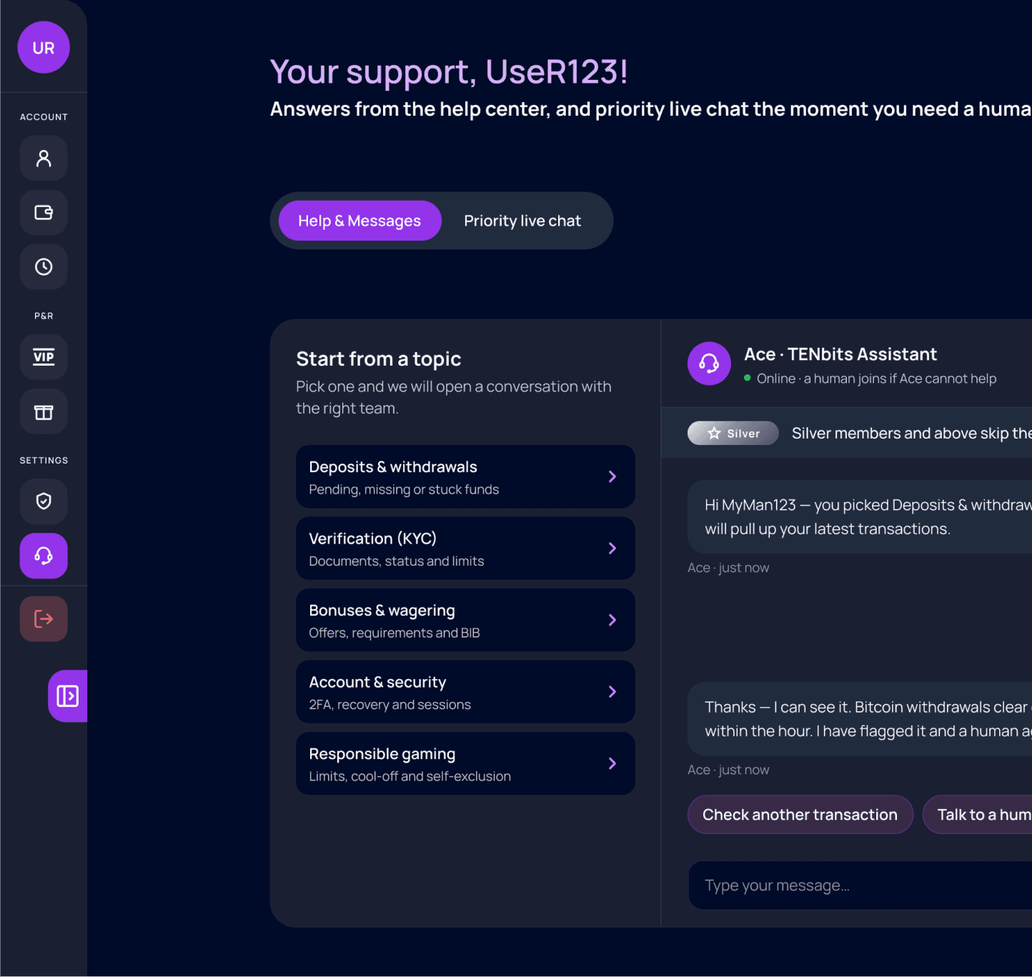
Support
Help-center chat is available to every player with priority live support for Silver members and above, providing faster assistance when needed.
Casino games
The game rooms rebuilt around the same rule: the table is the interface, and every control has to be findable without leaving the game.
GAME 01
CRASH
A multiplier you can read at a glance
The graph panel was redesigned with a clearer curve, stronger visual contrast, making it easier for players to follow the game and understand the number they are betting against as it changes.
GAME 02
SPEEN THE WHEEL
The wheel keeps the center to itself
Recent spins, targets and chip value moved out to the rails so nothing crowds the spin, and the bottom bar reads in the order a round happens: stake, spin, maximum win.
GAME 03
CARD ROOM
A table that fills the screen it is given
Controls moved to the edges of the felt and the balance was separated from the exit, fixing a review finding where tapping the amount dropped players out of the room.
GAME 04
LIVE CASINO ROOM
Eight seats without crowding the table
A centered oval with seat pods on a ring keeps every player, stake and timer readable at eight seats the felt was rebuilt for the layout rather than scaled down.
Mobile Experience
Casino play often happens away from a desk, on a commute, in a queue or on the sofa. The game room needs to stay clear in one hand, work smoothly when the screen rotates and always show the player that the game is activ
Why mobile and landscape decide the experience

Four categories, portrait to landscape
MOBILE 01
SLOTS ROOMS
Loading state
MOBILE 02
WHEEL ROOMS
Loading state
MOBILE 03
CARD ROOMS
MOBILE 04
CASINO ROOMS
Loading state
Loading state
Impact & Outcomes

Crypto Casino
Redesigning a live crypto casino into a consistent, readable and mobile-ready product.
Collaboration
1 Developer
1 Stake Holder
Tools Used





Understanding the Challenge
The product had an alpha version. The redesign had to improve a product people were using, inside the constraints of an existing codebase and a small team.
Context

Design objectives
Research
Three casino case studies, five competitor sites, published player reviews and a SWOT analysis - run on a FigJam board and reduced to the findings that changed the design.
Casino case studies reviewed

Competitor analysis


User and product reviews

SWOT analysis

Research insights that shaped the redesign

Product Review
The live product was reviewed page by page and every issue was documented on the board. The findings were split into interface and search visibility problems then prioritized with the developer to decide what should be fixed first.
The Original product
Screens of the Main pages and one game as it was reviewed.
Screens of the Sidepanel pages as it was reviewed.
Website UI fixes
Website SEO fixes

The most urgent problems

New Design System
One token layer for color, type, spacing, radius, surfaces and effects, built so a fix could be made once and hold everywhere.
Core tokens

What the system changed

Redesigned Product
The redesign in three groups: the homepage and its major sections, the player account side panel and the game rooms themselves.
Homepage and major sections
VIEW 01
HERO & SIGN-UP
A clear and engaging first impression
The landing page opens with the most important information and draws players in through the brand’s unique visual style. The page then guides them through a sign-up CTA, an animated wallet explanation, a short safety guide and a preview of the game collection.
VIEW 02
QNA & FOOTER
Help that is reachable, and legal links that work
The FAQ was moved to a separate page so the landing page would stay focused and easier to scroll. Support was given a clear entry point while the footer legal links became functional and the unnecessary gradients were removed.
VIEW 03
SIGNED-IN & WALLET GUIDE
Guiding players from wallet setup to continued engagement
After signing in, players are introduced to a clear CTA that opens a visual guide for creating and using the crypto wallet. The page also includes engaging features such as a ranking system and reward tables to encourage continued play.
VIEW 04
HOME PAGE
The main player home after sign-in
The home page becomes the main control center. It gives quick access to games, alerts, rewards, profile settings and other player tools. Some parts cannot be shown, so this focuses on the overall structure and key insights from the page.
VIEW 05
GAMES LOBBY
A lobby you can narrow before you scroll
A seven-category selector makes the lobby easier to browse, helping players filter the game collection before scrolling through the full list.
Account side panel
Seven pages behind one panel, each helping players organize and access the important information they need in one place.
Profile
Identity, rank progress and verification sit in one column, with responsible gaming controls kept visible instead of buried.

Wallet
Balance and key actions come first, followed by secondary options and transaction history so players can quickly understand and manage their money.
Bet History
A readable table card so a player can audit their own play. The old build gave no way to review past bets at all.

VIP Club
Four tiers with explicit benefit lists, giving the loyalty structure most competitors already have and this product did not.

Promotions
Featured offers with live progress, daily, weekly and monthly timers so an offer’s deadline is never guessed at.

Security
Five security levels encourage players to strengthen their account step by step, supported by a global security score that shows their overall protection level

Support
Help-center chat is available to every player with priority live support for Silver members and above, providing faster assistance when needed.
Casino games
The game rooms rebuilt around the same rule: the table is the interface, and every control has to be findable without leaving the game.
GAME 01
CRASH
A multiplier you can read at a glance
The graph panel was redesigned with a clearer curve, stronger visual contrast, making it easier for players to follow the game and understand the number they are betting against as it changes.
GAME 02
SPEEN THE WHEEL
The wheel keeps the center to itself
Recent spins, targets and chip value moved out to the rails so nothing crowds the spin, and the bottom bar reads in the order a round happens: stake, spin, maximum win.
GAME 03
CARD ROOM
A table that fills the screen it is given
Controls moved to the edges of the felt and the balance was separated from the exit, fixing a review finding where tapping the amount dropped players out of the room.
GAME 04
LIVE CASINO ROOM
Eight seats without crowding the table
A centered oval with seat pods on a ring keeps every player, stake and timer readable at eight seats the felt was rebuilt for the layout rather than scaled down.
Mobile Experience
Casino play often happens away from a desk, on a commute, in a queue or on the sofa. The game room needs to stay clear in one hand, work smoothly when the screen rotates and always show the player that the game is activ
Why mobile and landscape decide the experience

Four rooms, portrait to landscape
MOBILE 01
SLOTS ROOMS
Loading state
MOBILE 02
WHELL ROOMS
Loading state
MOBILE 03
CARD ROOMS
Loading state
MOBILE 04
CASINO ROOMS
Loading state
Impact & Outcomes
